by Ilan Garibi and Gadi Vishne; Giangh Dinh, Beth Johnson and Robert Lang
Twenty. The total number of fingers we, Gadi and I, have in our hands. More than three years of folding hundreds of models, with many lab hours, and most importantly, a huge collection of quality papers, produced twenty paper reviews.
This is a project of four people; Gadi Vishne, my co-folder; Sara Adams and Dennis Walker, both are helping on the editing level; and me. Together, we have reached twenty paper reviews, so there's ample reason to celebrate that achievement.
Being in this celebratory mood, I asked three unique artists to share with us their love for paper. Beth Johnson, Robert J. Lang and Giang Dinh are all (mostly) figurative designers, and were delighted to help with this special review. Unlike our normal reviews, where we choose the paper and fold different types of models, here we took a new concept – what is best for a certain model? I asked all our participants to choose two or three models of their own creation, and share with us their preferred paper for folding them. The result is presented here, as one of the most interesting article you can find about origami papers!
Giang is taking us on a guided tour, interpreting my strict instructions a bit more loosely. Beth is the best student in class, following our exact terms and gives a thorough, in-depth analysis. Lastly, Robert shows his amazing storytelling ability, and takes us step by step through his way of choosing the right paper for him!
Giang Dinh, the Minimalist
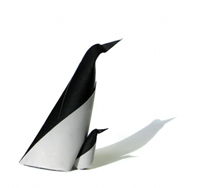
Penguin
This is a very simple model; most of it has only one layer of paper.
Watercolor paper
It is best wetfolded, and the best paper choice for me is watercolor paper. Obviously, it works well with water; thick paper will help with this mostly single-layer model; it is a black and white model, so I use black acrylic paint to color one side of the paper.
Paper: My chosen paper is Arches or Fabriano watercolor paper, 140lb (300gsm).
Aluminum foil paper
I also find that using duo-color aluminum foil paper can be fun!
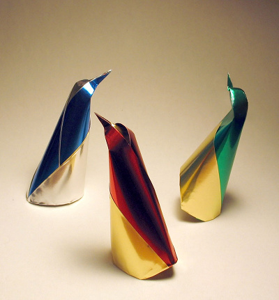
It is shiny and colorful, and conveys a very festive mood!
Paper: Folia aluminum foil – duo color – made in Germany
This aluminum paper is thin, so you can fold multiple sheets together (without gluing them) if you like.
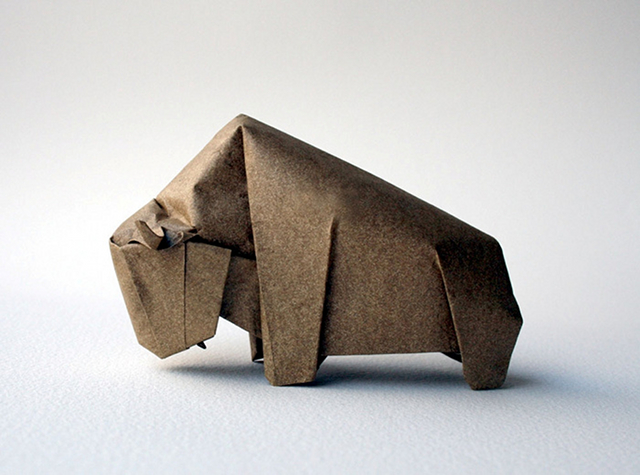
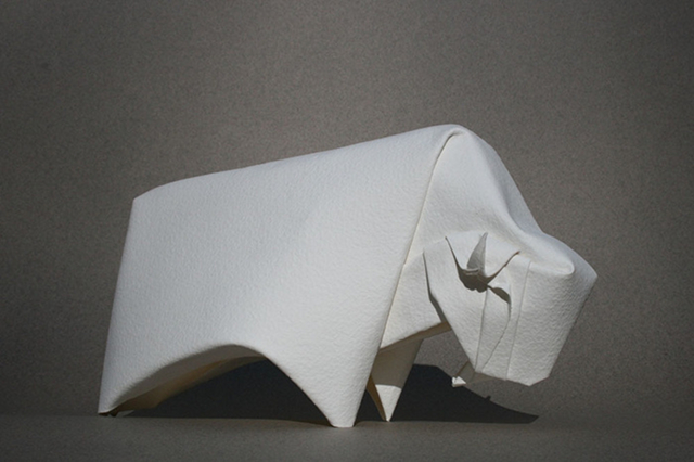
Bison
As with most of my models, it is best wetfolded. Again, with this model, the body only has a single layer of paper, so any thick paper suitable for wet folding will work.
Elephant Hide
Here is a study using Elephant Hide.
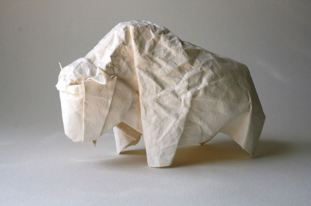
Watercolor paper
I like to also play with texture for the front part of the bison. Shown here is a study using watercolor paper. It is hard to control the crumpled part of the paper!
Foil-backed paper
My next step was to try foil-backed paper.
Paper: Thai soft metallic gold paper, bought at Plaza Art local store.
I glued together five or six layers of aluminum foil using spray glue (3M Super 77 spray adhesive). Since I did not want to see the foil edge I cut the foil slightly smaller than the paper.
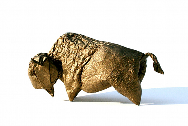
With this foil-backed paper, it is much easier to control the crumpled part of bison's front of the body.
However, watercolor paper is still my favorite paper, both because of its weight and its abstract whiteness. Here I used 140lb (300gsm) Arches watercolor paper with a rough texture.
Beth Johnson, the Elegant
Choosing which paper to use for a particular model is always a challenging task, and for me, it goes hand-in-hand with the design process. For some of my models, I know that I haven't yet found the right paper and the model doesn't feel complete. The right paper can be transformative, elevating a nice model into a piece of art.
I have experimented with a wide variety of papers and tend to gravitate towards a few favorites. I do not fold super complex models so I tend to prefer heavier paper that helps keep the model grounded. I also use a lot of tessellated patterns in my models that work better with paper that holds a sharp crease and has some weight to it. Finally, I often paint my paper, so I need something that allows for this. The two papers I chose to review have many of these qualities: Elephant Hide and Arches watercolor paper. I've selected two models that use these papers and will describe some of the qualities that make them my preferred choice for the model.
Hedgehog from Elephant Hide
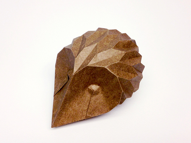
Texture
There are many qualities that make Elephant Hide a good choice for tessellations and corrugations - its memory, durability, and forgiveness to name a few. But there is one quality to this paper that is not so obvious that makes this a good choice for patterned folds: it has a smooth texture that reflects light and tends to highlight the patterns. The hedgehog exemplifies this effect perfectly. This model is designed almost entirely around a corrugated pattern, with very few additional folds to form the hedgehog. When this model is folded with paper that has a matte finish, the light gets absorbed and the creases don't tend to "pop" as much, and the form doesn't stand out like it should.
Paper Coloring
Elephant Hide does not come in a wide variety of colors, but it is very easy to paint, and the results can be beautiful. I like to paint paper, as it gives me more control over the look and color. I use brown and black paint for the hedgehog and the outcome looks very organic, the paper doesn't look "flat", and each hedgehog has its own unique look.
There are many options for painting, but I prefer water-based spray paints that are sold for scrapbooking, such as Glimmer Mist and Lindy Stamps. These are available in some craft stores and can be ordered online. I spend a lot of time blending the paints and using different techniques to create the look I want.
Memory
This model is held together by the curve of the corrugation, so it's essential that the paper keeps its shape and that the folds don't spread over time. After folding, I spray a little water to shape the hedgehog and let it dry; as a result it holds its shape perfectly and seems to hold up over time.
Weight and Thickness
Elephant Hide is on the thicker side and weighs in at a hefty 110gsm. The hedgehog is quite simple in its construction; the creases create the shape without any overlapping folds. Because of the structure of this model, I feel the thicker, heavier paper helps make it more robust. I'd actually prefer that it were heavier. I've tried other paper with a heavier weight, but they just don't work as well as the Elephant Hide.
Mask Series from Arches Watercolor Paper, cold press, 90 and 140lb
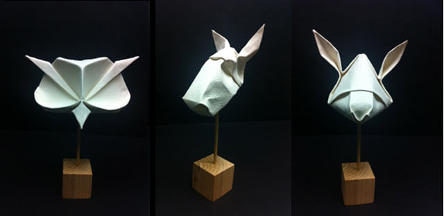
Weight and Thickness
Arches watercolor is offered in two weights: 90 lb (165gsm) and 140 lb (255gsm). I prefer the 140lb paper and choose this when I can. If the model has too many layers, I will then chose the lighter weight. This paper is fairly thick and heavy and must be wet folded. It's very difficult to bend while dry, and it can crack if it's forced into a fold.
The paper is the perfect choice for my mask series as the weight and texture help give the masks a sculptural feel. The finished forms look as if they could have been made from plaster.
Texture
This paper can be purchased in three different finishes: hot press (smooth, flat finish), cold press (textured finish), or rough (more pronounced textured finish). I prefer the cold press. The paper has a beautiful look to it. Though it is commercially made, the texture does not have a uniform pattern and thus feels more natural. Finished models have a very clean and elegant look to them, which is one of the many reasons I prefer this paper for my masks.
Paper Coloring
This paper only comes in white, and looks beautiful as is. I often choose to leave it white. But it is meant to be painted and takes paint beautifully. When painting it, I first get the paper slightly damp and then brush on light layers of acrylic paint until I get the shade I like. This helps maintain the texture while absorbing the tint of the paint. A thick layer will look too smooth and will hide the texture.
Once the paper dries, it can still be wetfolded after it is painted. It's important to make sure the water is absorbed first, and that the surface of the painted side is not wet, or else the paint may rub off on your hands and color your unpainted side. The balance can be tricky.
Wetfolding
This paper is a dream to wetfold. It creates nice, soft lines and once it dries, holds its crease forever. Sharper lines are also possible by scoring crease lines with a bone folder before wetfolding, which is what I do for many of my animal masks. It is important to have a very clean workspace when wetfolding this paper, though, as the white finish can be easily marred or stained.
Aging and Wear and Tear
This paper is incredibly strong and durable. A finished model is solid and very difficult to damage. However, the matte white finish is at risk of getting dirty over time and must be handled with care.
Robert J. Lang, the Engineer
Beachcomber, opus 641 (2013); "O'Malley Crackle" paper from Cave Papers
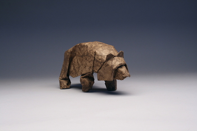
I designed this figure after seeing an Alaskan brown bear along the sea coast during a trip through southeast Alaska. The bear was wandering along the shore at low tide, turning over rocks, flipping hundred-pound boulders as if they were pebbles, and gobbling up the small fish stranded by the tide in puddles underneath each rock. I aimed to capture the smooth sleekness and sense of power in my design by creating a very smooth surface with minimal extraneous fold lines.
I did my testing and development with inside-out foil, which I often use for practice, but I knew that the final version would be wetfolded. On the trip, I'd only brought Canson Mi-Teintes, which is my all-around heavy wetfolding paper, so I folded one from that to prove out the design, but for the final figure, I wanted a paper with a bit more texture to capture the shagginess of the bear. I've long admired Cave Paper's wares, particularly "O'Malley Crackle", a walnut-dyed, gelatin-sized medium-weight paper. It is air-dried without pressing, which makes it slightly rumpled and very tough. The rumpled texture and color gives the sense of the coat of the bear; the toughness allowed me to wrench some of the folds quite a bit in the shaping, which helped give a sense of motion and "power under the surface."
Katydid HP, opus 629 (2013); "Robert Lang Insect Paper" from Origamido Studio
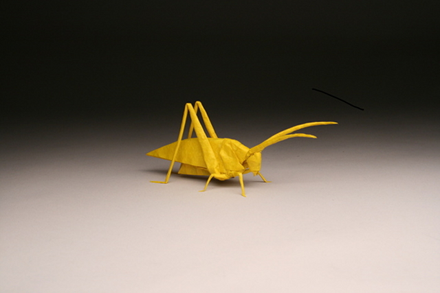
I designed this figure as part of my continued exploration of alternative geometries for uniaxial bases; "HP" denotes "hex-pleating," which is like box-pleating, but is designed on an equilateral triangular grid rather than squares. I find that hex-pleating is a bit harder to design with than box-pleating, but it gives more interesting crease patterns, so I like to try it out once in a while.
For most of my complex insects, the go-to paper is Michael LaFosse and Richard Alexander's "Origamido" paper, of which I have accumulated quite a collection over the years (from purchases, gifts, and batches I have commissioned). The thickness varies from sheet to sheet, with the average probably around 20gsm. Michael kindly named some of his paper for me (which is a bit embarrassing: even if there were no "Robert Lang," there'd still be awesome insect papers from Origamido Studio). Most of my sheets are about 40×60 cm, so most things I fold from them are from 40cm squares or thereabouts. I typically surface-size the sheet with CMC and dry it on glass before I fold. I fold the base dry, then selectively dampen bits for the final shaping.Diagrams will be published in an upcoming book from Gallery Origami House.
Amatl Pot, opus 623 (2012); amate paper from Hiromi Paper
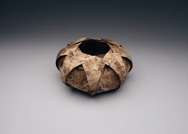
This is another in the series of rotationally symmetric pots I've made inspired by southwestern pottery. It was designed specifically for the paper it's folded from. Amate paper is made from pounded bark, and has an ancient history in Mesoamerican culture. Folded paper ornaments made from this paper are recorded by the Spanish in the 1500s in the Codex Borbonicus (they kindly recorded the native culture prior to wiping it out). Furthermore, stone Olmec statues from the 12th and 13th century show figures with ornamentation similar to what the Spanish recorded, suggesting a much deeper history for this art. As Professor Mary Miller of Yale told me, "Amate paper was everywhere, and everywhere it was cheap." And so, interestingly, Mesoamericans' use of folded amate paper might actually be the oldest "origami" — paper folded for decorative purpose — in the world!
Modern amate paper is made pretty much the same way as it always was; the bark is pounded until it forms a mat of stringy fibers, which is then formed into sheets and dried. The stuff made today is about 150gsm, but is highly variable in thickness and is rather stiff. It also tends to have weaknesses where bundles of parallel fibers have few cross-links where it is susceptible to splitting. So it is pretty hard to work with. When I designed the pot for it, I gave it a low-order rotational symmetry (only 8-fold) to cut down on the number of creases, and, as with all of my pots, the creases are laser-scored into place. (I don't think the Mesoamericans used lasers... but who knows what kind of secret advanced technologies they might have had in addition to crystal skulls? But I digress.)
To add a little strength to the paper, I surface-sized it with CMC, then air-dried it unconstrained (rather than sticking it on glass to dry —shrinkage causes rips if you do that). I scored in the crease pattern, then very lightly dampened it to soften the paper and keep the folds from cracking. This is rather a lot of work to accommodate the vagaries of this paper — folding the same design from Canson Mi-Teintes would be a snap — but the significance of the paper, its deep history, and the lovely surface texture of the finished form made it well worth the effort.
Crease pattern: https://langorigami.com/artworks?name=amatl_pot