Look and Feel
Model Suitability (out of 10):
Attributes (out of 10):
During the Tanteidan convention a year ago, I managed to get my hands on many Japanese papers. Korukii (コルキー) was one of them, and like our other Japanese papers, it is made and distributed by Takeo. I waited almost a year for it to become available online. So now that Nicolas Terry sells it, I can finally review it!
The western name, Corky, suit this paper perfectly. The paper is both embossed and colored reminiscent of cork. And it looks stunning. But unlike with Kaiser, which we reviewed last time, our big group of testers did not find consensus. Opinions ranged from poor to highly recommended.
Properties
- Thickness: We measured a weight of 80 gsm and 83 gsm on two different sheets. Korukii has a thickness of 138 microns. These values are very similar to those of Tant, which weighs 80 gsm and is 127 microns thick.
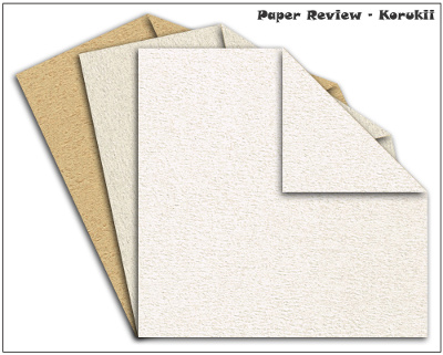 Only three colors are available, image courtesy of origami-shop.com
 - Sizes: Nicolas Terry sells squares with a side length of 15cm (6in) and 35cm (13.8in). We did not find a source for full sheets.
- Colors: 3 colors are available: off-white, light brown and a light grey-brown, like sandstone.
- Paper Coloring or Colorability: I used brown acrylic paint. The paper easily absorbed the paint without leaking to the other side and the color dried smoothly. The colored sheet was 1.5 mm longer with the grain and stayed the same against the grain.
- Texture: Corky is indeed a suitable name! The paper has a rough surface, with some random embossing, and the color is spread unevenly. As all colors are light, backlighting gives stunning effects and the 3D embossing gives the paper an interesting look.
- Photogenic: Absolutely stunning! As the paper has a matt finish, you can use a flash without fear of shine. The texture shows up very clearly and looks natural, similar to animal hide.
- Aging and Wear and Tear: Korukii scored 417 and 580 in the tear machine. For comparison, Elephant Hide practically doubled that, scoring 1130. I wasn't careful enough with my bone folder once and I got a small tear. All in all, it's still an above-average paper in this aspect. 8 out of 10.
- Memory: Average. When I folded a waterbomb base, it didn't stay flat, but opened up like a blooming flower. 7 out of 10.
- Forgiveness: Good - if you work slowly, you can reverse creases without problems. 8 out of 10.
- Tensile Strength: We refer here to the maximum stress the paper can undergo while being stretched or pulled. With the grain, the paper endured 7.79kg, stretching by 3.58 mm before tearing. Against the grain, the paper tore at 4.4 kg already, but stretched by 10.73 mm - a full cm! 7 out of 10.
- Bending Resistance: This section rates the amount of force you need to apply to get a sharp crease and how strong the paper is while being curved. The results, 178 and 64, are much better than those we measured for Tant (104/54), which has a similar paper weight. This shows how stiff the paper is. 8.5 out of 10.
- Price group: Expensive – think thoroughly before using – for a best friend's wedding gift.
- Where to buy:
- origami-shop.com: 15cm, 35cm squares
- origamishop.us: 35cm squares
Test results
Modular/Unit Origami
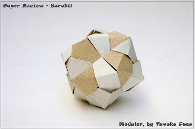
Modular by Tomoko Fuse, 6 units, 15×15cm
Elad Goshen folded this model.
I used three different colors for this model; I generally feel that this paper is soft and not perfectly suitable for this model. The different colors of paper vary a bit, too: the darker the paper, the stiffer it was.
Folding the units went relatively smoothly. It was slightly more difficult than usual to follow the crease lines and the reverse folds were a bit of a challenge.
The assembly was a totally different story. It was a real challenge, because the units are very flexible. They did not join together tightly, resulting in small gaps between the assembled units. The final model is therefore not as stable as expected from this model.
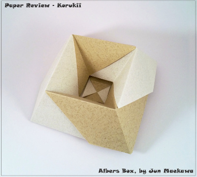
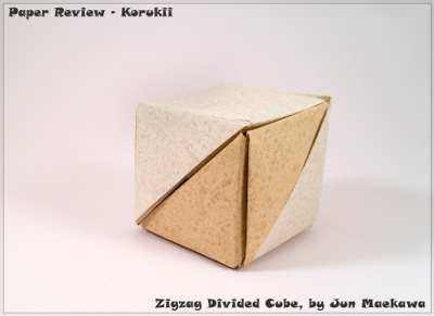
Zigzag Divided Cube (2 units) and Albers Box (4 units) by Jun Maekawa, 15×15cm
Guy Loel folded these models.
This paper indeed has a beautiful texture and a rough surface. While folding both models, which are simple enough, I had some hiccups: the colors are very bright and it was hard to see crease lines; and reversing folds was not easy at all, the paper is too soggy.
I expected to have a lot of friction when assembling the units because of the surface roughness. I was surprised to see it wasn’t like that at all. Tabs jumped out of the pockets, and I had to fight to keep them in. The models tended to fall apart easily, as the units didn’t cling to each other.
Tessellation
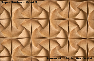
Square of Life tessellation by Ilan Garibi, 35×35cm
The first crease I made gave me the impression of an average paper: not stiff, breaks in a soft way - no big drama. It is easy to reverse creases. There is a slight difference between folding with the grain or against the grain. When folding against the grain, you break the fibers and there is a little sense of resistance. The crease does not fold flat until you use a bone folder.
When precreasing, I felt the paper is a bit floppy, as if the paper has no backbone. When I tried to crease the diagonal of a 1:2 rectangle, it was hard to get the line to run through the crease intersections.
The collapse was surprisingly easy, accurate and without obstacles. I was sure the paper would have very little spring, and that the surfaces would collapse under the pressure, rather than holding tight. But they did not and it took me less time than expected to complete the model!
The final result is mesmerizing. The texture is small enough to benefit the model and it really looks like folded cork.
3D models
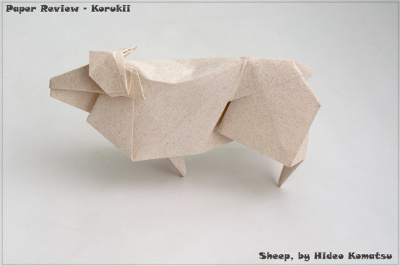
Sheep by Hideo Komatsu, 35×35cm
During the first step the paper felt very crisp. The creases fall into the right place, rather than breaking. This stiffness is helpful with the closed sink (steps 57-58). Just before I pushed the paper in, I was almost sure that here the paper would tear, but it didn’t. After that, the fold was uneventful. The paper is thin enough to accumulate layers with little interference and I managed to sharpen the legs without any trouble.
The final model is very clean and elegant.
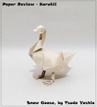
Snow Goose by Tsuda Yoshio, 35×35cm
Ynon Toledano folded this model.
This paper has a medium thickness and I found it suitable for this model. I didn’t have any problem with reversing the creases. I got the sense the paper is strong and won’t tear, even if I challenge it.
It was easy to shape the goose as I liked. I could add all the details I wanted to, and the 3D shape is stable. Most impressive is its final look, the texture is total eye candy!
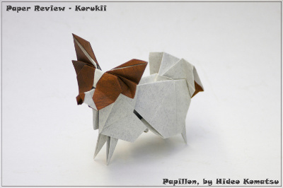
Papillon by Hideo Komatsu, 35×35cm
Elad Goshen folded this model.
As this is a color change model, I used a white sheet and colored one side with brown acrylics. Unfortunately, the paper became more flexible than it was originally. Folding Komatsu models with flexible papers is something I usually avoid, so I expected a challenging fold.
While folding, it was hard to achieve sharp and accurate creases. Crease lines were not visible enough, and the paper's low memory makes reversing folds hard to accomplish. Step 116 requires a reverse fold for the dog's back and it was a difficult procedure that required shaping. The precreases for the sink folds did not hold, so considerable efforts were necessary to carry out the fold on the right creases.
On the upside, the high flexibility of the paper made shaping the legs and the dog’s head as easy as a walk in the park. The final result is impressive: the paper's texture gives the model a natural and appealing appearance.
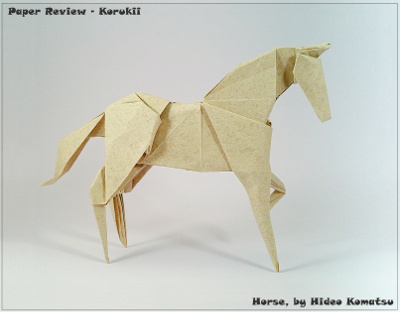
Horse by Hideo Komatsu, 35×35cm;
Guy Loel folded this model.
This paper falls between two weight categories: it is neither thin paper, nor is it heavy. This shows in the folding. I found it too thick when layers accumulate, and too thin for the legs to hold the weight of the horse.
Its surface is rough, so I was sure there would be only little drift when you fold four layers into eight. Again, I was disappointed. I had to fight to make sure layers stayed together.
Still, the final model is very impressive. The texture is elegant and unique and feels alive.
Final verdict
With a growing team of test folders, summarizing our different impressions grows harder. We could not agree on multiple aspects, which shows yet again what a diverse group of folders we are. And although we had different thoughts on how well the paper folds, we all agreed that this paper has an absolutely stunning texture. It is indeed a beautiful paper. But, as it often does, this comes with a price tag. The paper might be too expensive for some.
Another consensus we could reach is that the paper feels soggy. It doesn't react well when tampered with again and again, and its flexibility can drive you mad when assembling modulars. With its mid-range thickness, it's not suitable for complex models, but it is really worth your effort for intermediate 3D models. The paper is also more than suitable for tessellations, and the collapse phase went with ease for me.
Why should you buy it?
For this unique look, are you willing to pay the price? The reward is high!
Bottom line: try it yourself!

